-
Young2Rice
- Veteran
-
- Posts: 71,676
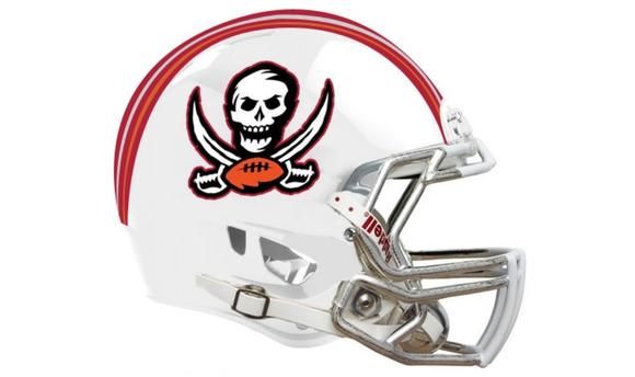
The logo is way to ugly to be that big.
-
lucky_49
- Veteran
-
- Posts: 763
pretty bad. the chrome facemask actually looks nice but it's not like anyone's going to notice that ever
-
Rathmanator
- Veteran
-
- Posts: 899
I despise the Bucs and that fat, stupid idiot of an "analyst" Sapp. He was on NFLN slobbering over it as if the mighty Bucs helmet meant something to the rest of the league.
That helmet makes me want to puke because of it. It isn't just ghey, that is Kevin Spacey ghey.
They xhould go back to the creamsicle garbage.
-
49AllTheTime
- Veteran
-
- Posts: 71,702
What's new ?
-
m_brockalexander
- Veteran
-
- Posts: 13,358
So the logo is bigger, the helmet is gold not pewter, and the face mask is chrome. That's it?
Why is it enhanced? Or is it really just enlarged? Also, the red flag is ugly.
[ Edited by Rubberneck36 on Feb 20, 2014 at 6:48 PM ]
-
fropwns
- The Last Fronin
-
- Posts: 27,642
- NFL Pick 'em
Originally posted by Dr_Bill_Walsh:

Is this like trimming the bushes around your deck to make it look bigger?
-
49AllTheTime
- Veteran
-
- Posts: 71,702
Now it's really a wanna be raiders logo
-
Raul98
- Veteran
-
- Posts: 1,304
Enhanced more like totally screwed up it looks terrible there helmet was fine the way it was but they have to live with it not us so oh well.
.
[ Edited by ninerfan4life on Feb 20, 2014 at 7:40 PM ]
-
jimrat
- Veteran
-
- Posts: 23,935
-
kazak13
- Veteran
-
- Posts: 926
wow so ugly.. i thought they are bringing back the buccaneer
-
StOnEy333
- Hall of Fame
-
- Posts: 99,663
Looks like an arena league helmet.
-
LVJay
- Veteran
-
- Posts: 27,847
This year is already flying by... Halloween can't come any sooner doe