There are 162 users in the forums
NEW ALT. UNIFORMS
Oct 31, 2011 at 10:24 PM
- gamechanger
- Member
- Posts: 799
Oct 31, 2011 at 10:27 PM
- OnTheClock
- Hall of Fame
- Posts: 37,201
Originally posted by gamechanger:
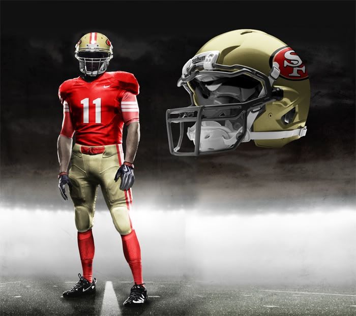
Cool design for a display, but would not want to see these on the football field. No thank you.
Oct 31, 2011 at 10:31 PM
- Dr_Bill_Walsh
- Veteran
- Posts: 20,260
- NFL Pick 'em
no to nike amateur pacifist monstrosities
Oct 31, 2011 at 10:38 PM
- gamechanger
- Member
- Posts: 799
Originally posted by Dr_Bill_Walsh:
no to nike amateur pacifist monstrosities
Stop living in the past, this aint even real. It was done by a person that took the time to actually do something different and new. The uni's you post are horrible and I doubt the players would like your designs. I mean look at the NBA, you don't see them going back to the short shorts LOL. You probably still wear baggy clothes.
Oct 31, 2011 at 10:52 PM
- Dr_Bill_Walsh
- Veteran
- Posts: 20,260
- NFL Pick 'em
Originally posted by gamechanger:
Originally posted by Dr_Bill_Walsh:
no to nike amateur pacifist monstrosities
Stop living in the past, this aint even real. It was done by a person that took the time to actually do something different and new. The uni's you post are horrible and I doubt the players would like your designs. I mean look at the NBA, you don't see them going back to the short shorts LOL. You probably still wear baggy clothes.
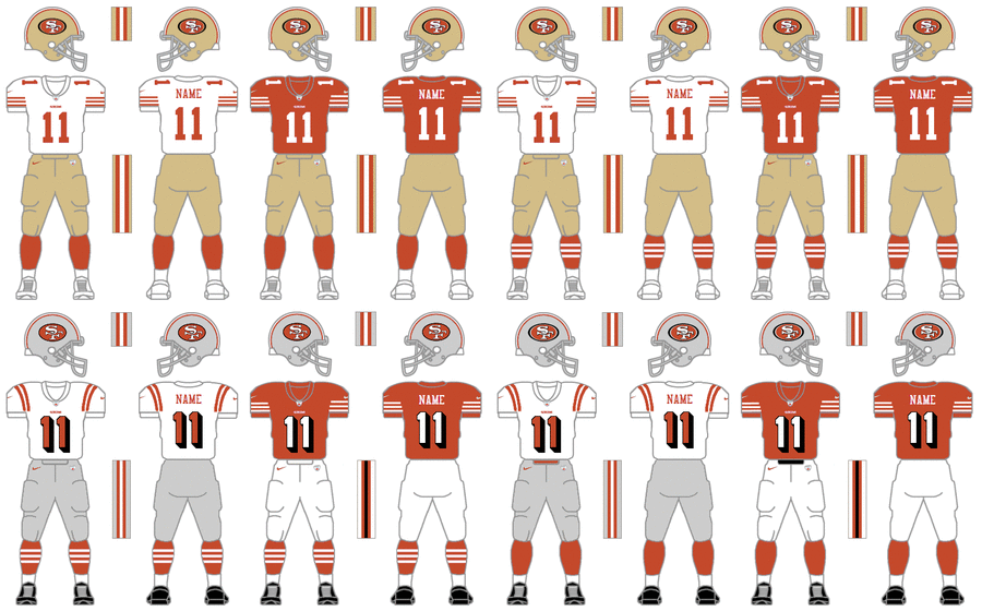
have fun with the riot by a majority of niner fans if those are ever worn. the niners are NOT a flashy, oregon U, uni guinea pig type team...the team is along with the bearsm packers, cowboys, raiders, colts etc. among the "classy" uni crowd...not the dumb, dated in 3 years cardinals, seahawks, bengals, falcons crowd. most players will like whats looks sharp and timeless...not tacky and overly busy. i don't care how long it took whoever made the above mockups...its the end result that matters & the end result is still meh...the team has moved beyond the late 90's fad of BFBS (black for black's sake) and that yuck cardinal red...IMO if a past uni from 50's were an inspiration, it ought to be something more distinctive than the drab 1956 uni (all white helmets and pants?!) you're entitled to your preference, but i'm unconverted in my preference for 1955/94 and 1962-63 as a basis for an alternate/throwback.
Oct 31, 2011 at 10:59 PM
- gamechanger
- Member
- Posts: 799
Originally posted by Dr_Bill_Walsh:
have fun with the riot by a majority of niner fans if those are ever worn. the niners are NOT a flashy, oregon U, uni guinea pig type team...the team is along with the bearsm packers, cowboys, raiders, colts etc. among the "classy" uni crowd...not the dumb, dated in 3 years cardinals, seahawks, bengals, falcons crowd. most players will like whats looks sharp and timeless...not tacky and overly busy. i don't care how long it took whoever made the above mockups...its the end result that matters & the end result is still meh...the team has moved beyond the late 90's fad of BFBS (black for black's sake) and that yuck cardinal red...IMO if a past uni from 50's were an inspiration, it ought to be something more distinctive than the drab 1956 uni (all white helmets and pants?!) you're entitled to your preference, but i'm unconverted in my preference for 1955/94 and 1962-63 as a basis for an alternate/throwback.
Keep posting your ms paint unis and try presenting it to a team vs someone using the Nike template lol.
Oct 31, 2011 at 11:10 PM
- Dr_Bill_Walsh
- Veteran
- Posts: 20,260
- NFL Pick 'em
Originally posted by gamechanger:
Originally posted by Dr_Bill_Walsh:
have fun with the riot by a majority of niner fans if those are ever worn. the niners are NOT a flashy, oregon U, uni guinea pig type team...the team is along with the bearsm packers, cowboys, raiders, colts etc. among the "classy" uni crowd...not the dumb, dated in 3 years cardinals, seahawks, bengals, falcons crowd. most players will like whats looks sharp and timeless...not tacky and overly busy. i don't care how long it took whoever made the above mockups...its the end result that matters & the end result is still meh...the team has moved beyond the late 90's fad of BFBS (black for black's sake) and that yuck cardinal red...IMO if a past uni from 50's were an inspiration, it ought to be something more distinctive than the drab 1956 uni (all white helmets and pants?!) you're entitled to your preference, but i'm unconverted in my preference for 1955/94 and 1962-63 as a basis for an alternate/throwback.
Keep posting your ms paint unis and try presenting it to a team vs someone using the Nike template lol.
psssh....your disparaging of my method of presenting my designs illustrates PERFECTLY (as a metaphor for our differing uniform design preferences) why your arguments IMO fails. what you deem "MS Paint" (i actually use a template from http://www.gridironuniforms.com/, editing it with Adobe PS if you must know) works perfectly fine for me in expressing my idea of what i want the uni to look like in an economical, succint, no-nonsense manner. Your preference someone's seemingly more realistic and complex illustration with all its superfluous renderings and dramatic shadowing and lighting cannot compensate for what I feel is a flawed design (if they do a corresponding 1955/1994 or 1962-63 rendering I might be inclined to liking it). think of it like those silly 4-banger cars that get all souped up with spoilers, lighting, flashing lights, flatulent mufflers and god knows what else...all that fluff in the end cannot conceal a glaring and readily apparent difficiency.
your entitled to your opinion, but i'll stick with mine.
Oct 31, 2011 at 11:13 PM
- gamechanger
- Member
- Posts: 799
Originally posted by Dr_Bill_Walsh:psssh....your disparaging of my method of presenting my designs illustrates PERFECTLY (as a metaphor for our differing uniform design preferences) why your arguments IMO fails. what you deem "MS Paint" (i actually use a template from http://www.gridironuniforms.com/, editing it with Adobe PS if you must know) works perfectly fine for me in expressing my idea of what i want the uni to look like in an economical, succint, no-nonsense manner. Your preference someone's seemingly more realistic and complex illustration with all its superfluous renderings and dramatic shadowing and lighting cannot compensate for what I feel is a flawed design (if they do a corresponding 1955/1994 or 1962-63 rendering I might be inclined to liking it). think of it like those silly 4-banger cars that get all souped up with spoilers, lighting, flashing lights, flatulent mufflers and god knows what else...all that fluff in the end cannot conceal a glaring and readily apparent difficiency.
your entitled to your opinion, but i'll stick with mine.
Post ur unis again so I can get a good laugh.
Oct 31, 2011 at 11:17 PM
- Dr_Bill_Walsh
- Veteran
- Posts: 20,260
- NFL Pick 'em
come up with a rendering of your own (that's NOT a Nike "pro combat" *rolls eyes* template) and then we can start dancing....
*drops glove*
*drops glove*
Oct 31, 2011 at 11:20 PM
- Dajanksta
- CrankyJanke
- Posts: 68,328
- NFL Pick 'em
Those are ugly as f**k. Get over it jesus Christ lol.
Oct 31, 2011 at 11:22 PM
- backontop
- Veteran
- Posts: 14,346
Good God why does everyone want to go to these ugly ass Nike Pro Combat style uniforms? They are ugly as f**k!!!!!! IF anything bring in a mix of the 80's and 90's uni's not this wannabe "modern" crap. The s**t doesn't even look good.
Oct 31, 2011 at 11:26 PM
- Dr_Bill_Walsh
- Veteran
- Posts: 20,260
- NFL Pick 'em
Here (since I'll honor your challenge):
...your entitled to dislike my design, that's your choice, but don't disparage the effort I still put in illustrating it all together unless you're prepared to put in the same effort in expressing your preference. Posting some other person/corporation's slick but IMO underwhelming design don't cut it with me
Oct 31, 2011 at 11:27 PM
- Dr_Bill_Walsh
- Veteran
- Posts: 20,260
- NFL Pick 'em
Originally posted by backontop:
Good God why does everyone want to go to these ugly ass Nike Pro Combat style uniforms? They are ugly as f**k!!!!!! IF anything bring in a mix of the 80's and 90's uni's not this wannabe "modern" crap. The s**t doesn't even look good.
thank you. a kindred spirit.
Nov 1, 2011 at 9:07 AM
- gamechanger
- Member
- Posts: 799
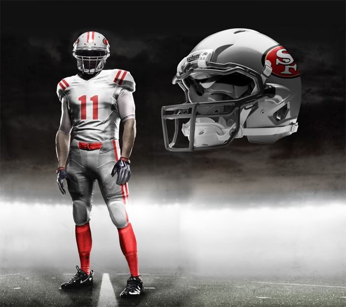
Originally posted by Dr_Bill_Walsh:Here's what I did...
come up with a rendering of your own (that's NOT a Nike "pro combat" *rolls eyes* template) and then we can start dancing....
*drops glove*
Nov 1, 2011 at 9:26 AM
- gamechanger
- Member
- Posts: 799
I kinda like the white gold idea...