There are 282 users in the forums
Old Logo or New Logo
Old Logo or New Logo
Nov 3, 2011 at 2:08 PM
- tmpluff
- Veteran
- Posts: 814
- NFL Pick 'em
I overall like the new logo better, but I like how the upper left part of the "F" was on the Old logo.
Nov 3, 2011 at 2:11 PM
- MiamiNiner
- Veteran
- Posts: 951
Cant really tell a difference
Nov 3, 2011 at 2:16 PM
- SnakePlissken
- Veteran
- Posts: 15,028
I used to be hard-pressed on us returning to our old logo, but the new logo looks so much f**king better on our new/retro (non-metallic gold) helmets. -It's almost as if the logo sticks out more than it previous did, since the outlining shade of gold nitched around the 'new' logo FINALLY MATCHES the helmets base-color.
Nov 3, 2011 at 3:05 PM
- 9ermex
- Veteran
- Posts: 1,020
New easyy
Nov 3, 2011 at 3:12 PM
- FILTHpigskin
- Veteran
- Posts: 2,530
Originally posted by Niners99:
new logo easily. its just an improvement of the old one.
the old was too basic and plain. just a SF with a thick black oval around it. the newer one made it more sleek, and the touch of gold made it more "49ers".
if you look at the logo on a red backdrop, adding the gold band is a HUGE improvement.
This!
Nov 3, 2011 at 3:17 PM
- hondakillerzx
- Veteran
- Posts: 19,274
new
Nov 3, 2011 at 3:18 PM
- Kam_mamba
- Veteran
- Posts: 66
dont really matter to me, either way we have the best uniform in the league.
Nov 3, 2011 at 3:35 PM
- SoTx9R
- Veteran
- Posts: 4,201
New logo 

Nov 3, 2011 at 3:38 PM
- DonnieDarko
- Veteran
- Posts: 65,393
old logo
Nov 3, 2011 at 3:43 PM
- AlexSmithNWessonOil
- Veteran
- Posts: 75
I like the old one because it was easy to draw all over my books and binders and peechee folders when I was ten.
Nov 3, 2011 at 4:50 PM
- Dr_Bill_Walsh
- Veteran
- Posts: 20,486
- NFL Pick 'em
Wish they'd gone all-out old school to the 1989-1995 logo when they did the whole 80's-inspired redesign in 2009, but it's perhaps a little too late now (unless Nike next year "corrects" it). I doubt it though, because IIRC, during the whole 2-year redesign process (2006-08), the team and Reebok did actual tests in a stadium setting to see how the current uniform and helmet combo would look as a whole both with the natural eye ( ie, to spectators) and through the camera (in a TV broadcast/TV screen).
They found that the newer logo with extra gold border and black trim/shadow on the "SF" popped out more and was more highly visible than the plainer 1989-95 oval logo. Also, the fact that keeping basically the same logo as the 1996-2008 version (just in a brighter red) would save $$$ in changing over alot of stuff @ team HQ, on merchandise, etc. etc., probably was another big factor (this is the Yorks after all).
As for the facemask, grey is a nice, neutral, "old-school" color that unassumingly blends in well with the overall uni (as well as harkens back to the 80's look). Since the team switched to a brighter scarlet red, having corresponding bright scarlet facemasks would be too garish and loud IMO. Red facemasks worked with the 1996-2008 helmets, 'cos obviously it used a darker cardinal/crimson red.
As for the person wanting a return to the 1998-2008 look (in the Gore pic), the team probably might use that as a throwback....IN LIKE FORTY YEARS! We all still have to forget/purge the dark ages of the Erickson, Nolan and Singletary eras first from our collective memories!
They found that the newer logo with extra gold border and black trim/shadow on the "SF" popped out more and was more highly visible than the plainer 1989-95 oval logo. Also, the fact that keeping basically the same logo as the 1996-2008 version (just in a brighter red) would save $$$ in changing over alot of stuff @ team HQ, on merchandise, etc. etc., probably was another big factor (this is the Yorks after all).
As for the facemask, grey is a nice, neutral, "old-school" color that unassumingly blends in well with the overall uni (as well as harkens back to the 80's look). Since the team switched to a brighter scarlet red, having corresponding bright scarlet facemasks would be too garish and loud IMO. Red facemasks worked with the 1996-2008 helmets, 'cos obviously it used a darker cardinal/crimson red.
As for the person wanting a return to the 1998-2008 look (in the Gore pic), the team probably might use that as a throwback....IN LIKE FORTY YEARS!
 We all still have to forget/purge the dark ages of the Erickson, Nolan and Singletary eras first from our collective memories!
Nov 3, 2011 at 5:41 PM
- Dr_Bill_Walsh
- Veteran
- Posts: 20,486
- NFL Pick 'em
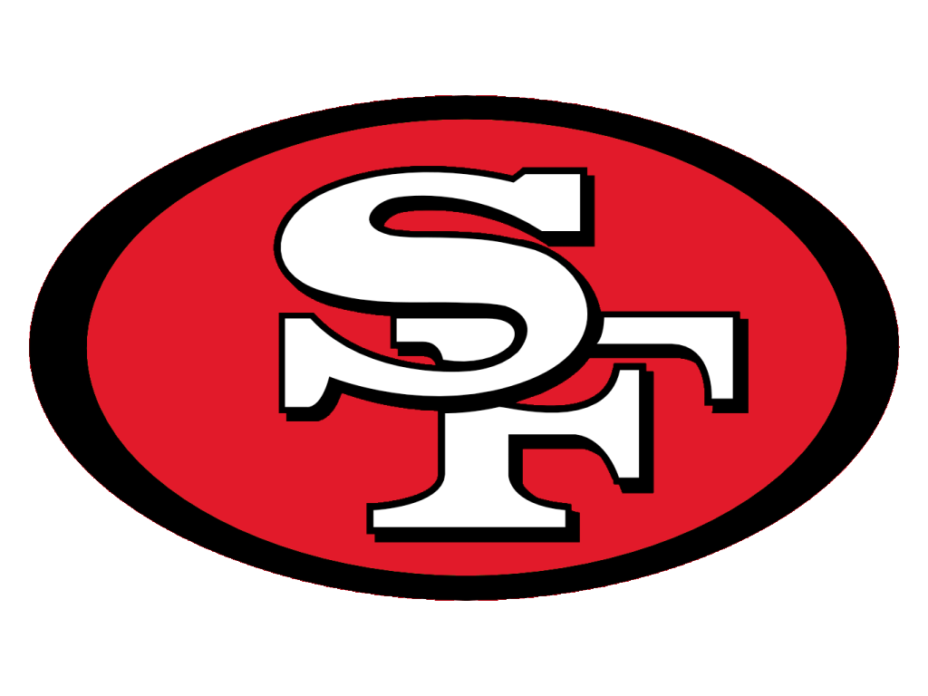
What they should've just done:


(combined old & new basically, "stretched black border, no gold border in red oval, black trim/shadowing on the "SF")
oh well....

Nov 3, 2011 at 5:48 PM
- VA49er
- Veteran
- Posts: 2,863
All I see is a white SF with red and a black border. 

Nov 3, 2011 at 5:54 PM
- Dr_Bill_Walsh
- Veteran
- Posts: 20,486
- NFL Pick 'em
Originally posted by VA49er:
All I see is a white SF with red and a black border.
Look closer....it's NOT the same as the 1989-95 logo:

^ thinner, non-stretched black border around red oval, "SF" only has thin black trim & NO shadow effect.
Nov 3, 2011 at 6:19 PM
- putangina
- Veteran
- Posts: 5,563
Old logo, but the new one's still sexy. Close enough.