
There are 308 users in the forums
Old Logo or New Logo
Old Logo or New Logo
Nov 3, 2011 at 6:43 PM
- SFSK8R89
- Veteran
- Posts: 4,338
New logo but change our pants color, straight hideous, the suns reflection off the pants makes us look like the Mcdonalds 49ers red n yellow red n yellow
Nov 3, 2011 at 7:12 PM
- Dr_Bill_Walsh
- Veteran
- Posts: 20,276
- NFL Pick 'em
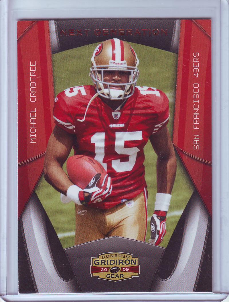
they did have shiny pants @ the 2009 draft party when they unveiled the current unis (also when crabtree was shooting his rookie card pics)...

dunno WHY they later made them a dull, matte gold (probably to approximate the 80's pants)...but i agree, the Niners should match & trump a certain texas team and also have metallic pants that match the metallic helmet
dunno WHY they later made them a dull, matte gold (probably to approximate the 80's pants)...but i agree, the Niners should match & trump a certain texas team and also have metallic pants that match the metallic helmet
Nov 3, 2011 at 7:16 PM
- LeftBankeNiner
- Veteran
- Posts: 1,382
just win
Nov 3, 2011 at 8:26 PM
- tohara3
- Veteran
- Posts: 29,029
- NFL Pick 'em
Originally posted by LeftBankeNiner:
just win

Nov 3, 2011 at 8:55 PM
- superniner
- Veteran
- Posts: 34
The old one. It's the one that I have tattooed on my chest.
Nov 3, 2011 at 9:43 PM
- GorefullBore
- Veteran
- Posts: 4,243
- NFL Pick 'em
It's a toss up for me.
Nov 3, 2011 at 9:48 PM
- GorefullBore
- Veteran
- Posts: 4,243
- NFL Pick 'em
Originally posted by KowboyKiller:
LOOLLLLL j/k
Here's an interesting site I found about failed alternative logos from other teams over the years:
http://www.misterhabs.com/nfl-proto.htm

I remember when Eddie was pondering switching to that logo.

Nov 3, 2011 at 9:53 PM
- GorefullBore
- Veteran
- Posts: 4,243
- NFL Pick 'em
Originally posted by susweel:
Originally posted by oldman9er:
Pretty much the same, don't care... both are fine.
What I dislike on both... is what I dislike on the pants and jerseys as well. All those damn white stripes!!!
Looks like a bunch of moving candy-canes. I miss this one most.
l
First time I ever seen Gore wearing thigh pads.

I don't think anyone was talking about those uni's. I think they they were refering to the 80's uni's or the current retro uni's we switched to in 09(There is a difference if you look close). The one's in your picture are from 97(I think) to 08. If I misunderstood what you were trying say, sorry, but that's my 2 cents.
Nov 4, 2011 at 5:43 AM
- Candlestick_Monsta
- Veteran
- Posts: 86
New logo, no doubt. Though that old school one Niner_Demon added is great too haha.
Nov 4, 2011 at 6:39 AM
- mannydawson
- Veteran
- Posts: 357
Are you bored
Nov 4, 2011 at 9:01 AM
- Happs
- Veteran
- Posts: 746
Originally posted by Dr_Bill_Walsh:
What they should've just done:
(combined old & new basically, "stretched black border, no gold border in red oval, black trim/shadowing on the "SF")
oh well....

Now that is cool! Love it.
More modern looking but still have the nice contrast of the red and black up against each other.
Nov 4, 2011 at 9:53 AM
- DJD
- Veteran
- Posts: 2,806
new
Nov 4, 2011 at 10:06 AM
- bigmike55
- Veteran
- Posts: 3,474
New
Nov 4, 2011 at 1:22 PM
- Niners99
- Veteran
- Posts: 43,676
Originally posted by Dr_Bill_Walsh:
What they should've just done:
(combined old & new basically, "stretched black border, no gold border in red oval, black trim/shadowing on the "SF")
oh well....
nope, because theres still no gold in it. put that logo on a red background, and it looks horrible. gold HAS to be in the logo.
Nov 4, 2011 at 1:43 PM
- Bejaard49er
- Veteran
- Posts: 971
Originally posted by GorefullBore:
Originally posted by KowboyKiller:
LOOLLLLL j/k
Here's an interesting site I found about failed alternative logos from other teams over the years:
http://www.misterhabs.com/nfl-proto.htm
I remember when Eddie was pondering switching to that logo.
Right there with you. One of the few times Eddie was not in touch with the fans. The back lash Eddie got trying to introduce a new logo was insane people were seriously p**sed off.
Always thought the logo of the shooting miner would have been cool to do something with but will probably never see anything come of it.